One of the quieter decisions in ordering a custom hanko is also one of the most visible. The engraving style — the font, in plain language — determines how your seal reads, how it looks on paper, and whether anyone can actually decipher the characters it produces. Most people ordering for the first time scroll past this choice quickly, pick whatever looks most “Japanese,” and move on. That is a reasonable instinct, but it leaves something on the table.
Hanko font styles carry different histories, different levels of legibility, and different social signals depending on where the stamp is used. A tensho seal script that looks authoritative on a formal contract can become an illegible smear on a delivery slip. A kaisho style that reads clearly on an everyday receipt might look underdressed for a registered seal submitted to a ward office. The choice matters, and it is not complicated once you understand what each style actually is.
This guide explains the main engraving styles used for hanko in plain terms, compares them honestly, and helps you match the right style to your actual use case — including the specific situation of a foreign name being transliterated into Japanese characters. By the end, you will know exactly which option to select and why.
Why Fonts Matter
A hanko is a functional tool. When it is pressed onto paper — whether that paper is a housing contract, a bank form, a package receipt, or a handmade card — the ink impression is the output that matters. Everything else is the means of producing it.
Font style affects three things directly:
Legibility. Some engraving styles produce impressions that are immediately readable. Others are deliberately complex, ornate, or abstracted — legible to trained eyes, opaque to everyone else. For a seal used in daily life, legibility is often a practical virtue. For a seal used in formal or official contexts, some level of complexity can actually serve a purpose: it makes the seal harder to replicate casually.
Register. Different styles carry different social weight. This is not arbitrary. Tensho and reisho scripts have been used in formal and official contexts in Japan for centuries. Kaisho is the standard printed script most Japanese people learned to write. The style you choose signals something about how the seal is intended to be used, even if the person receiving the impression never consciously registers it.
Appearance. This matters too, and there is no reason to pretend otherwise. A hanko used as a personal stamp on artwork, correspondence, or journaling should look the way you want it to look. Aesthetic preference is a legitimate factor in the choice.
The common mistake is treating font selection as purely decorative — picking the most visually striking option without considering how the impression will read in context. A seal that looks impressive in a product preview but produces an illegible stamp on a form is not serving you well.
Quick Font Comparison
The three styles you will encounter most often when ordering a custom hanko are tensho, reisho, and kaisho. There are others — gyosho (semi-cursive), sosho (grass script), and various house styles used by individual artisans — but these three cover the vast majority of use cases and are the standard options at most hanko makers.
Tensho (篆書)
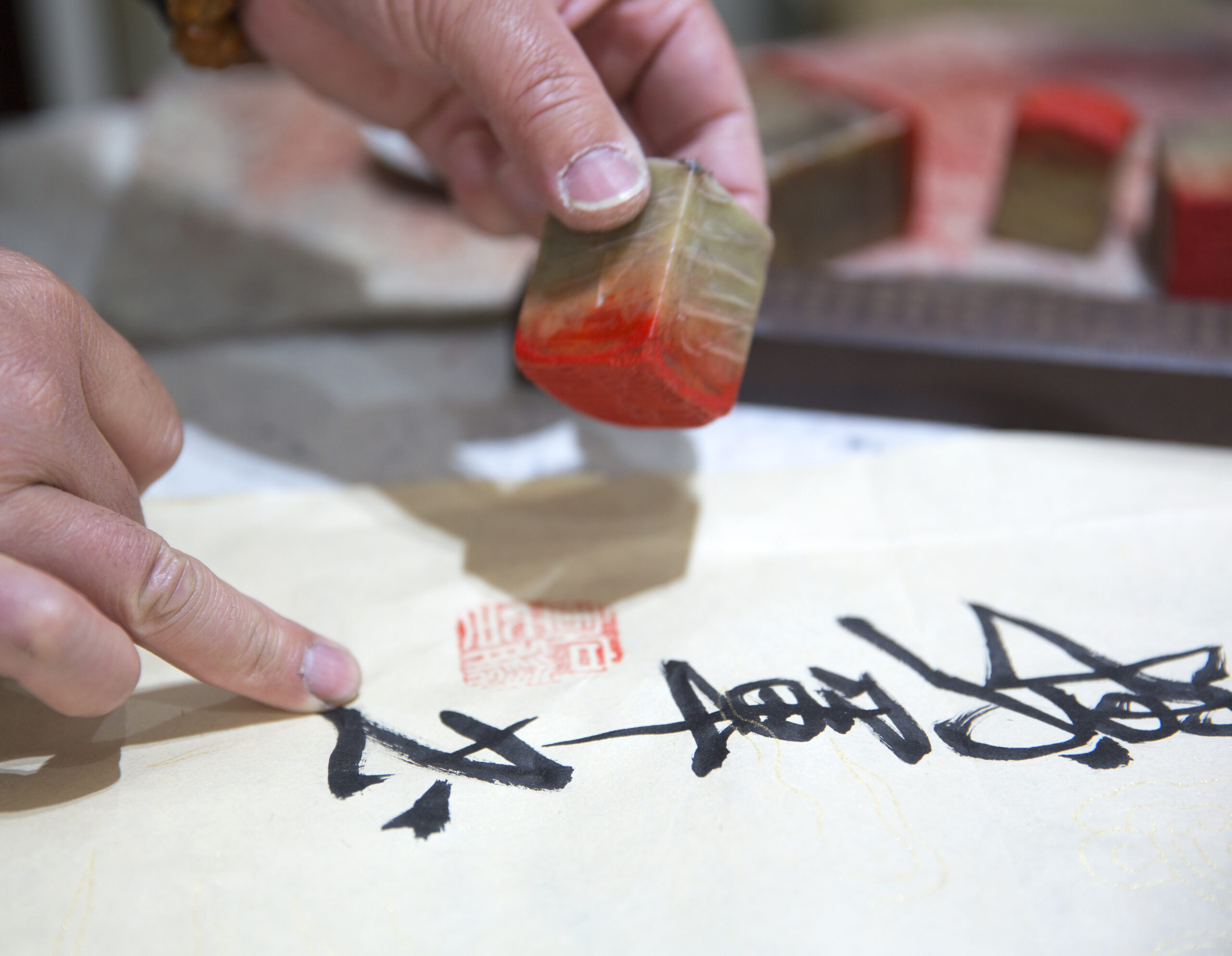
Tensho, known in English as seal script, is the oldest of the three and the one most closely associated with formal hanko use in Japan. It developed in China during the Qin dynasty and was standardized as the script used for official seals — hence the name. The characters are rounded, architecturally balanced, and composed with a visual symmetry that fills a circular or square frame elegantly.
What tensho looks like in practice: fluid strokes of relatively even thickness, curves that feel deliberate rather than gestural, and a density that makes the overall impression feel complete and considered. Individual characters are often difficult to read without training, particularly for people not already familiar with standard kanji forms — tensho modifies many strokes in ways that diverge from modern printed Japanese.
The main tradeoff: it is beautiful and carries significant formal weight, but legibility for a foreign name in katakana is lower than with other styles.
Reisho (隷書)
Reisho, or clerical script, developed slightly later than tensho and represents an evolution toward greater readability while retaining formal character. The strokes are flatter and more horizontal than tensho, with distinctive flared endings on certain strokes — a feature sometimes called “silkworm head and wild goose tail” in classical descriptions. It reads as formal and deliberate without the abstraction of tensho.
What reisho looks like in practice: strokes with clear directionality, visible horizontal emphasis, and a structured quality that communicates care and permanence. It is more legible than tensho to a modern reader while still reading as a formal or official engraving style. It sits in a useful middle position.
Kaisho (楷書)
Kaisho is standard block script — the script form most Japanese people learned to write by hand, the basis of printed Japanese typography, and the most immediately legible of the three styles. Each stroke is distinct, character forms are conventional, and there is minimal ambiguity about what is written. A kaisho impression can be read at a glance by anyone literate in Japanese, and for katakana — the script most often used for foreign names in hanko — kaisho produces the clearest result.
What kaisho looks like in practice: clean, upright characters with no stylistic abstraction. It reads as straightforward and practical. In formal contexts it can feel slightly plain. In everyday use it is simply clear and functional.
Best Font by Use Case
Matching the right inkan font to the right situation is mostly a matter of being honest about how the seal will actually be used.
Registered seals (jitsuin) for official use: Tensho or reisho. These styles signal formality and are expected in contexts where the seal carries legal or institutional weight — property transactions, registered contracts, company seals. The complexity that reduces casual legibility also makes casual forgery harder. Banks and ward offices are accustomed to seeing these styles on formally registered seals.
Daily use seals (mitomein) for receipts and general paperwork: Kaisho or reisho. A seal used for package deliveries, workplace sign-offs, and everyday document handling benefits from clarity. The person processing your receipt does not need to decode your seal — they need to confirm it is present. Kaisho makes this fast. Reisho works well here too, particularly if you want something that reads as considered rather than purely functional.
Personal or artistic use: Any style, personal preference leading. If you are using a hanko as a stamp on handmade cards, artwork, journaling pages, or correspondence, the aesthetic is a legitimate primary criterion. Many people in this situation choose tensho for its visual weight, or a custom artisan style that falls outside the standard three categories.
A working example: a freelance designer based in Tokyo uses two seals — a tensho seal registered at the ward office for contract use, and a kaisho seal for daily receipts and client paperwork. The two-seal approach is common among long-term residents for exactly this reason.
Readability for Foreign Names
This section matters specifically for foreigners ordering a custom hanko, and it is worth addressing directly rather than folding it into general advice.
Foreign names are almost always rendered in katakana when carved on a hanko — the syllabic script used in Japanese to represent foreign words and names. Katakana characters are angular and relatively simple in their standard form. How they read on a seal depends heavily on engraving style.
Tensho applied to katakana produces an impression that can be genuinely difficult to read, even for native Japanese readers. Tensho’s stroke modifications were developed for kanji, and the script’s conventions do not always translate cleanly to the simpler katakana forms. The result can look visually impressive but functionally opaque.
Reisho applied to katakana performs better. The clearer stroke directionality makes individual characters more distinguishable, and the formal quality still comes through. For a foreign name on a seal intended for occasional official use, reisho is a solid choice.
Kaisho applied to katakana is the most legible option by a clear margin. The characters read as expected, the name is identifiable, and there is no decoding required. For everyday use — and particularly for foreigners who want a seal that can be used practically rather than just displayed — kaisho in katakana is the most functional combination.
One additional consideration: some hanko makers offer gyosho (semi-cursive) as an option. For foreign names in katakana, gyosho carries similar legibility challenges to tensho. It is worth avoiding for katakana unless the seal is purely personal or artistic.
If your name has more than three or four syllables in katakana, legibility becomes more important, not less. A long katakana name in tensho on a 10.5mm seal can become very dense. Kaisho at that length reads cleanly; tensho may not.
How to Choose in Checkout
Most hanko ordering processes — including HankoHub‘s — present font selection as a step in the configuration process, usually alongside material and size. Here is how to move through that step without second-guessing yourself.
Step one: confirm your use case. Are you ordering for formal or official use, everyday practical use, or personal and artistic use? This single question narrows the field significantly.
Step two: check the character set. Is your name being rendered in katakana, kanji, or a combination? If katakana, weight kaisho or reisho more heavily. If kanji, all three styles work and personal preference plays a larger role.
Step three: use the preview. HankoHub offers a custom preview that shows how your name will look in different styles before you confirm. Use it. The difference between styles is much clearer in a rendered preview with your actual name than in a general description.
Step four: consider the material alongside the font. Some materials — natural wood, ebony, buffalo horn — carry visual weight that pairs well with tensho or reisho. Synthetic materials and everyday-use pieces often pair more naturally with kaisho. This is not a rule, but it is a pattern worth noticing.
A checklist for the checkout decision:
- Formal or registered use → tensho or reisho
- Daily practical use → kaisho or reisho
- Foreign name in katakana → kaisho for clarity, reisho for a balance of formality and legibility
- Personal or artistic use → personal preference, any style
- Long name in katakana (four or more syllables) → kaisho strongly recommended
- Unsure → use the preview tool and compare directly
If your new employer asks for documents quickly, ComfysCareer can help you prepare early — then use this guide to pick a readable stamp style that will serve you through onboarding and beyond.
FAQ
What is the most common hanko font style used in Japan? Tensho is the most traditionally associated with formal hanko use and remains the default expectation for registered seals. Kaisho is more common for everyday use seals. Reisho occupies a respected middle position used across both contexts.
Can I use tensho for a foreign name in katakana? You can, but legibility will be lower than with kaisho or reisho. If the seal is primarily for personal or artistic use, tensho can look striking on a katakana name. If the seal will be used for official or practical purposes, kaisho or reisho will serve you better.
Does the font style affect whether a hanko is accepted officially? In most cases, no — the style itself does not determine acceptance. What matters is that the seal matches the registered impression on file if you have a formally registered seal. For unregistered daily use seals, no style is officially required. That said, tensho and reisho are the conventionally expected styles for registered seals in Japan, and presenting an unusual style in a formal context may attract unnecessary questions.
What is the difference between tensho and seal script? They are the same thing. “Seal script” is the English translation of tensho (篆書). The term reflects the script’s historical use as the standard form for official seals in East Asia.
Is gyosho a good option for a hanko? Gyosho (semi-cursive script) is used by some artisans for personal seals and can look elegant with kanji names. For katakana, it is generally not recommended — the semi-cursive modifications reduce legibility in a script that is already relatively simple in its standard form.
How do I know which font will look best with my name? Use a preview tool before confirming. The interaction between your specific name, the character count, the seal size, and the engraving style produces results that descriptions cannot fully anticipate. Seeing your actual name rendered in tensho, reisho, and kaisho side by side makes the decision straightforward.
What font does HankoHub use by default? HankoHub allows you to select your engraving style during the ordering process and provides a custom preview so you can compare options with your name before confirming. There is no single forced default — the choice is yours to make with full information.
Next Steps

Font style is one of the decisions that separates a hanko you reach for from one that sits in a drawer. Now that you know what tensho, reisho, and kaisho each do — and which suits your name, your use case, and your situation in Japan — the next step is seeing how they actually look with your specific characters. HankoHub offers a custom preview at checkout so you can compare engraving styles with your name before committing. Choose your style, confirm your material, and have a seal that does exactly what you need it to do.